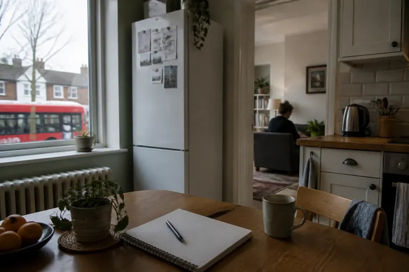
The Waiting Room Before the Waiting Room
The waiting room before the waiting room shapes how a visit begins. Learn to read its layout and see which kind of threshold suits the setting.
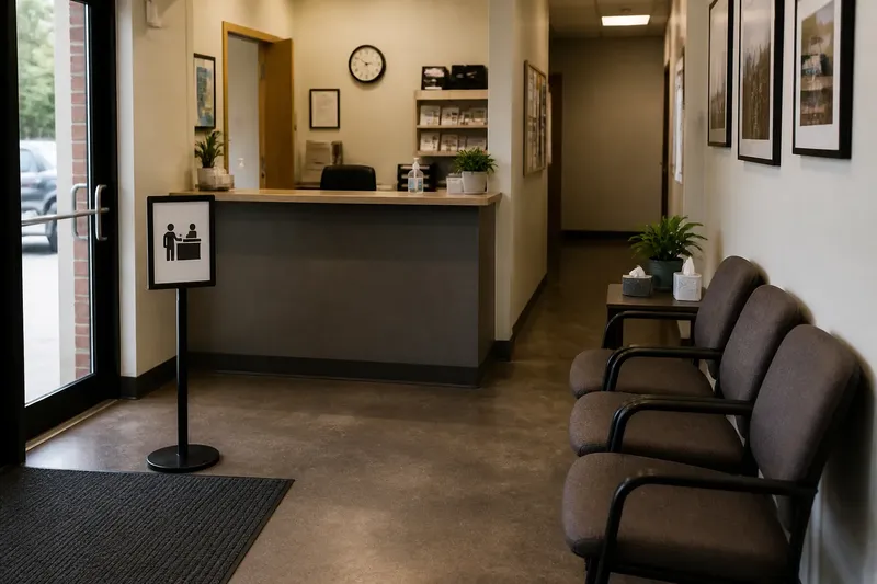
You arrive at a clinic, library, repair shop, or office and stop at the desk, though no one has asked you to sit yet. A line of chairs faces a counter. A sign points to another door. The visit has begun administratively, but the appointment, conversation, or service has not. That small in-between area is the waiting room before the waiting room: a space that holds people while the setting decides what happens next.
Its layout does more than provide somewhere to stand. It tells visitors whether to approach, wait, check in, keep moving, or stay out of the way. The furniture and signs form a quiet set of instructions. Read them well and the threshold feels legible; read them poorly and a person may feel as if they have arrived early to an event whose rules were not printed.
The first waiting room is a threshold, not a destination
Waiting has long been part of ordinary shared settings: people pause at a doorway, queue before a counter, or sit near the person who will call them forward. A dedicated place for this pause emerges when a setting gives waiting its own boundary and arrangement. That boundary need not be a separate room. A bench beside reception, a marked queue, or a few chairs beyond a check-in desk can all perform the same work.
The distinction is one of status. In the outer waiting area, the visitor is often still figuring out the process: who to tell, where to go, whether to take a number, and whether the door is private. The inner waiting area usually signals that the visit is underway in a more specific sense. Someone has acknowledged the arrival, and the next action belongs to the service provider. One is a threshold; the other is a holding place within the visit.
That difference can be expressed without elaborate design. A clear sign, a visible counter, or an obvious line of chairs can show where a person should pause. The arrangement works a little like a coat rack beside a front door: it marks a transition without needing to explain the entire house.
Three layouts give waiting different instructions
The open approach suits quick, visible check-ins
An open approach keeps the desk, entrance, and waiting seats in view of one another. Visitors can see where to ask for help and staff can notice new arrivals without a maze of partitions. This arrangement suits places where the next move is simple, such as checking in at a small office or asking for a service at a public counter.
Its weakness is exposure. A person may feel watched while reading a form or discussing a private matter, and a busy doorway can make the seats feel like an extension of the queue. Open layouts work best when the desk is easy to identify and the seating does not block people entering or leaving.
The buffered approach suits visits that need a little privacy
A buffered threshold uses a partial wall, a turn in the corridor, or seating set slightly away from the entrance. Visitors still have a route to the desk, but the first pause is less exposed to people walking past. This can suit a counseling office, a small medical practice, or any place where names and reasons for visiting should not become public conversation.
Too much buffering creates a different problem: staff may not know someone has arrived, and a visitor may hesitate to cross a boundary that looks private. A small sign or a visible check-in point helps distinguish a calm waiting nook from a room one should not enter.
The guided approach suits places with several steps
Some settings use a sequence: enter, take a ticket, complete a form, then sit until called. A guided approach makes that order visible through signs, a counter, a ticket dispenser, or a clear path through the room. It suits places where visitors need to complete the same preliminary actions before the actual service can begin.
The trade-off is that the sequence can feel like a test if instructions are scattered or use unfamiliar terms. A visitor should be able to tell what to do first without asking three people. Where the process is not obvious, a staff member or a concise sign can do more than another row of chairs.
Choose the layout by the first decision a visitor faces
To choose between these approaches, start with the first uncertainty at the door. Is the visitor’s first task simply to make contact? An open desk may be enough. Does the visitor need to pause without being exposed? A buffer can help. Must several actions happen in order? A guided route makes the sequence easier to read.
Then consider who might use the space and what they need to notice. A first-time visitor may need a visible sign more than a discreet corner. Someone carrying bags or using a mobility aid needs a route that is not narrowed by chairs or a standing queue. A person arriving with a child may need to remain near the check-in point rather than be sent to an unseen seating area. These are not separate design systems; they are reasons to test whether the first instruction is clear from the entrance.
Imagine a small repair shop where customers enter and see chairs facing the workbench, but no counter or sign. One person might sit, another might interrupt a technician, and a third might leave. If the owner adds a clearly marked check-in point beside the door and moves one chair out of the path, visitors can identify the first action while keeping the work area distinct. The expected observable result is fewer guesses about where to stand, not a magically shorter wait.
What does the first waiting room communicate?
How is it different from a lobby?
A lobby is a broad entrance or shared interior, while a waiting area has a more specific job: it holds people until the next part of a visit. A lobby can contain waiting seats, but its layout may also direct people to elevators, corridors, or other destinations.
Does every visit need a separate waiting area?
No. A clear counter, a marked place in a queue, or a simple instruction at the entrance may be enough for a brief interaction. A dedicated seating area helps when visitors must remain for a while or need a clear place to pause without blocking movement.
What makes a threshold confusing?
Confusion often comes from competing cues: chairs that look like an invitation to sit, a desk that appears closed, and a sign that points elsewhere. The visitor cannot tell which signal takes priority, so the setting quietly assigns them the task of guessing.
How can a visitor tell whether to check in first?
Look for a reception sign, a counter facing the entrance, a ticketing device, or an instruction beside the door. If none is clear, asking a staff member where to begin is a reasonable first move; the room has not made its process legible on its own.
Small cues make the threshold easier to read
A waiting room before the waiting room does not need formal architecture. Its usefulness depends on whether the arrangement answers three ordinary questions: where to go, where to pause, and what happens next. A sign can name the first action. A chair can indicate that waiting is expected. A clear gap between the entrance and the service area can keep the two activities from colliding.
For anyone shaping a shared interior, the most revealing check is to stand at the entrance and follow the cues in order, without assuming knowledge of the place. If the first action remains unclear, the layout is asking visitors to supply missing instructions. The waiting room before the waiting room earns its name when it marks the boundary plainly: you have arrived, but the visit has not yet begun.